Original title: Spanish design + Chinese QC: what ambitions lie behind Red Copper’s 26AW collaborative collection?
The following content is sourced from vogue.com.cn (VOGUE CHINA)
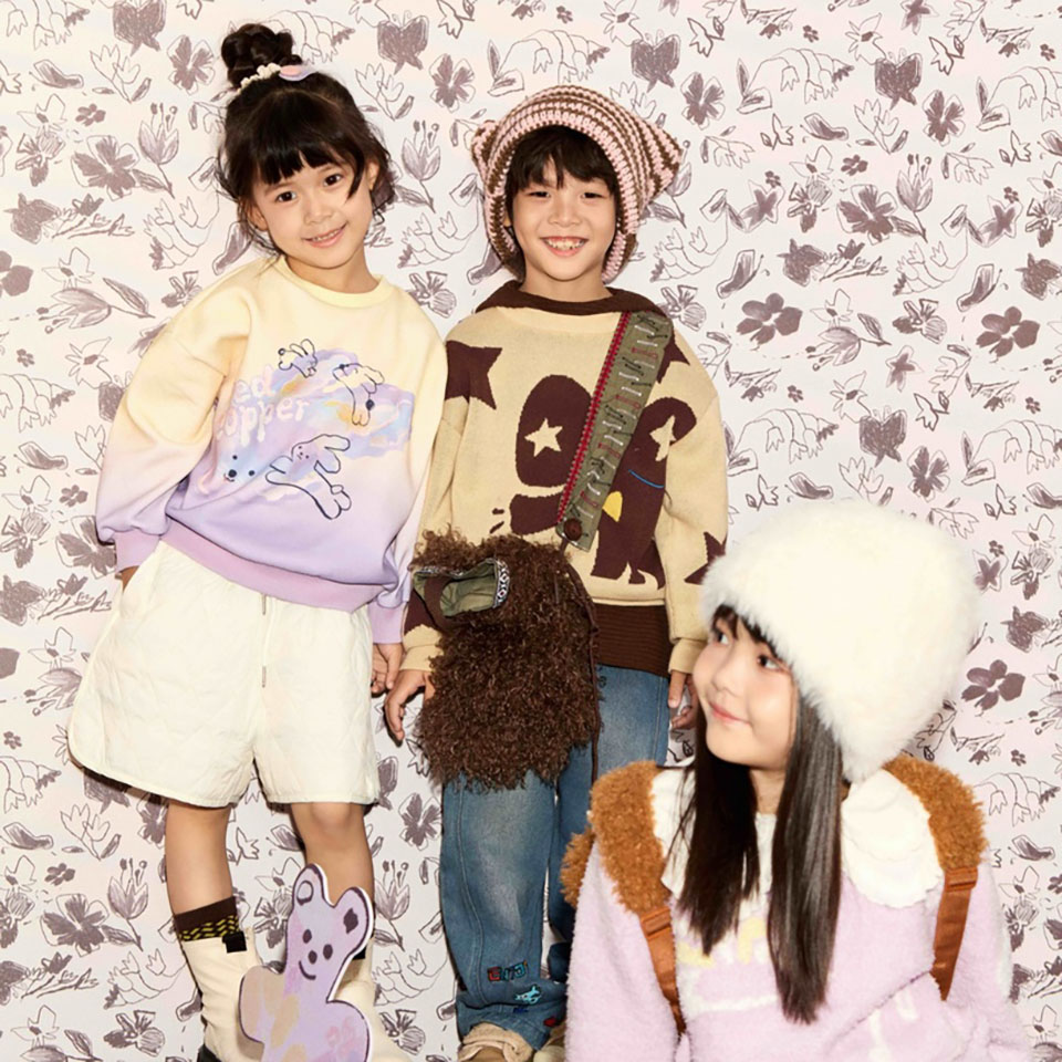
????????Recently, the domestic children’s wear designer brand Red Copper officially announced that its Autumn/Winter 2026 collection has been created in collaboration with a Spanish design team. This marks the first time the brand has brought in an overseas design team to lead the creation of patterns across an entire collection, with the results of this collaboration now being rolled out alongside the 26AW range.
????????From the autumn themes ‘A Festival of Flowers and Animals’ and ‘Starry Trails’ to the winter themes ‘The Secret Room of Plush’ and ‘Winter Forest’, these four thematic chapters collectively form Red Copper’s complete narrative system of patterns for this season.
????????According to Red Copper, this collaboration stems from an ongoing aesthetic dialogue between the brand and the Spanish design team, with both parties sharing a strong alignment on the concept of ‘childlike storytelling’. It was ultimately agreed that the Spanish team would be responsible for the entire process of the 26AW collaborative collection—from conceptualisation to the creation of the full range of patterns—whilst Red Copper’s in-house design and quality control teams would oversee the implementation, transforming the artistic patterns into ready-to-wear garments that meet Chinese children’s wear standards.
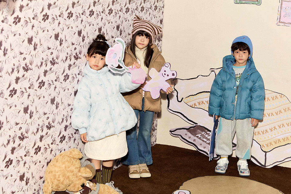
????????The brand has positioned this collaboration as a ‘pivotal moment in the evolution of product aesthetics’, hoping to infuse its existing ‘casual-chic’ and ‘casual-sport’ product lines with fresh visual narratives by incorporating mature international perspectives on children’s pattern design.
????????The core theme of the collaborative collection revolves around two fundamental aspects of childhood: fantastical dreams and athletic exploration.
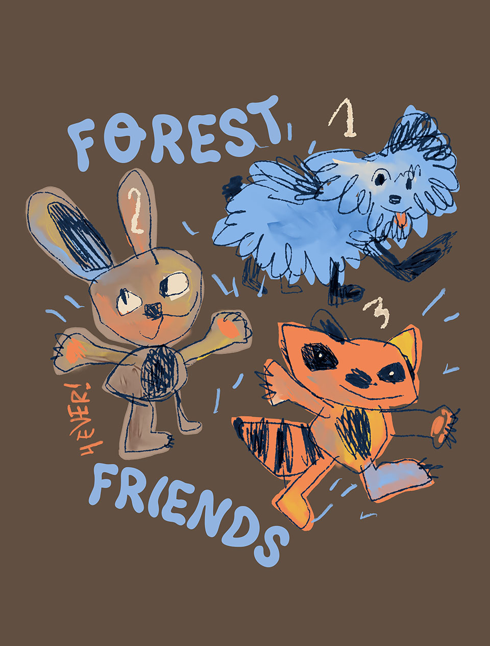
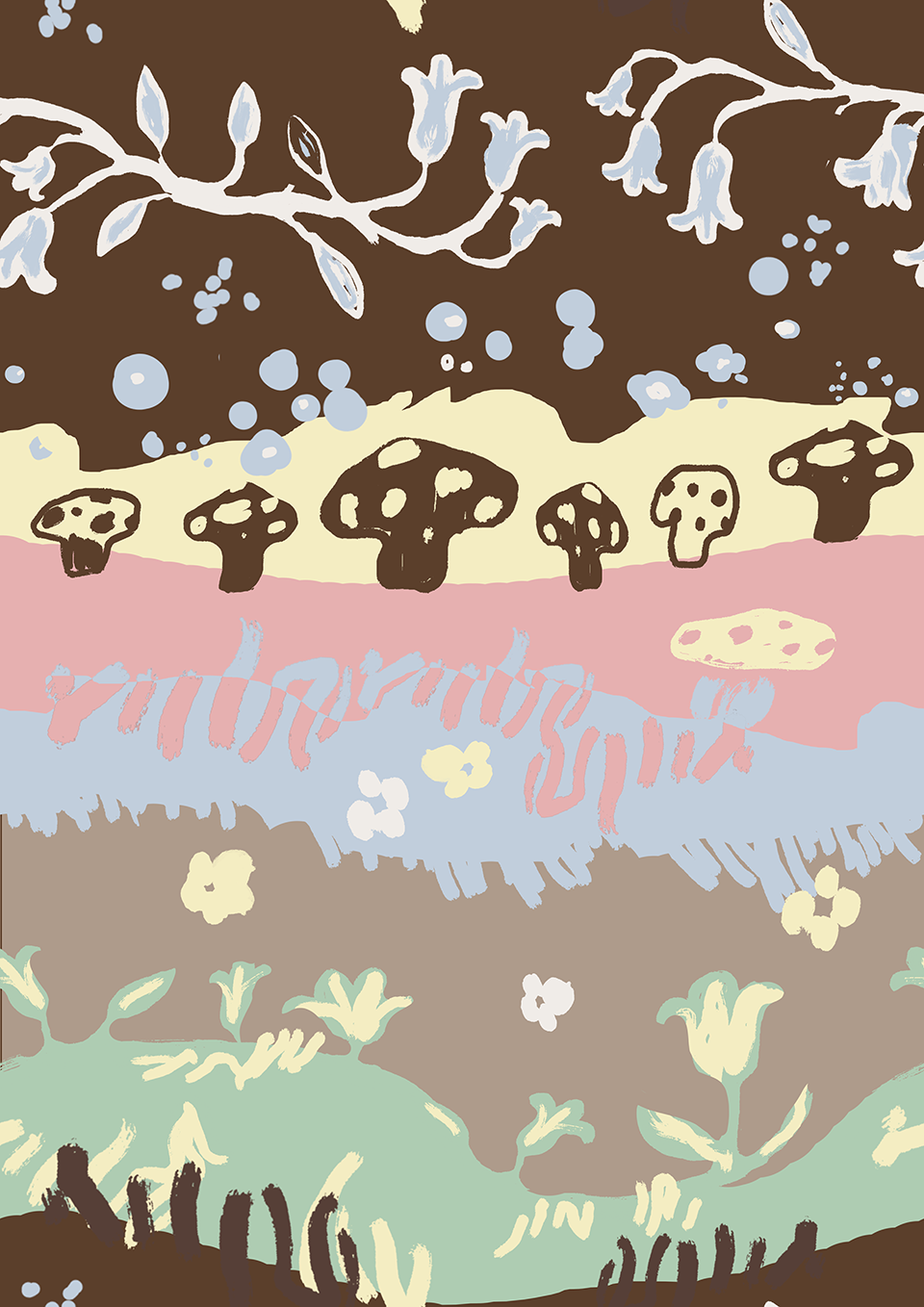
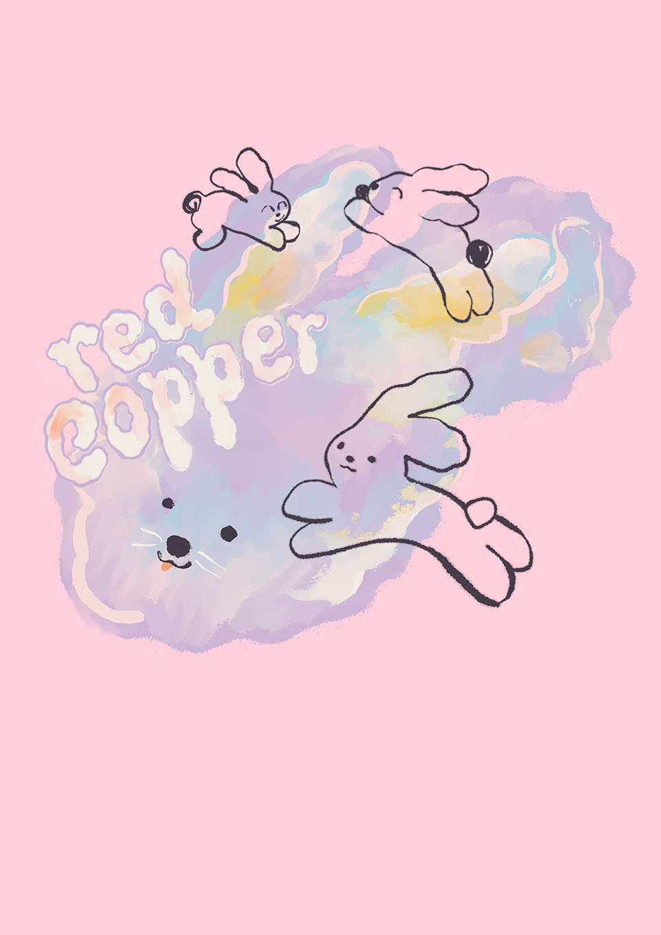
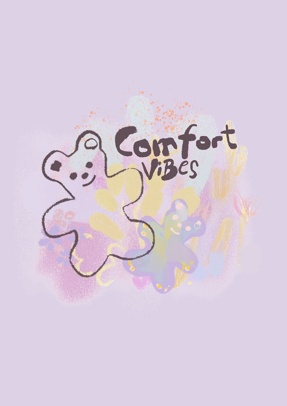
????????The winter highlight, *The Secret Room of Plush Toys*, tells a heart-warming fantasy tale: after a little girl turns off the light and leaves her bedroom, her plush toys come to life at night to play, conveying a sense of warm companionship. This theme resonates with Red Copper’s long-standing brand philosophy of ‘loving companionship’; ‘Winter Forest’, meanwhile, blends winter landscapes with the concept of a digital garden, creating casual sports-inspired patterns using a holographic, futuristic visual language. The patterns, created by the Spanish design team, feature bold experiments with colour; whilst some styles venture beyond the brand’s traditional colour palette, the silhouettes, fabrics and fit standards remain true to Red Copper’s long-established ergonomic cuts for children.
????????In terms of products, the collaborative collection covers key winter items such as down jackets, jumpers, hoodies and trousers, suitable for scenarios including school, urban travel and light outdoor exploration, with prices aligned with the brand’s core price range. This product portfolio aligns directly with Red Copper’s long-standing focus on its ‘Light Trend’ and ‘Light Sport’ product lines: the Light Trend line continues its romantic, childlike style, whilst the Light Sport line matches the product ethos of outdoor exploration and energetic activities.
????????In striking a balance between artistic expression and practical wearability, Red Copper has established clear priorities. The brand stated in an interview: ‘Pattern aesthetics are a bonus; fabric safety and comfort are always the top priorities for children’s clothing.’ During the pattern development stage, the in-house team becomes involved at an early stage to evaluate printing techniques, prioritising eco-friendly, soft and crack-resistant printing solutions; all fabrics and fillings fully comply with domestic children’s clothing safety standards.
????????From a commercial strategy perspective, the significance of this collaboration for Red Copper extends beyond the differentiation of a single season’s products. The brand revealed that this season marks the first tangible collaboration with the Spanish team, with work on the 27SS collection currently underway, and scope for continued co-creation in the future.
????????More notably, Red Copper is establishing a collaborative system involving a diverse range of designers: in addition to the Spanish team, South Korean designers will also be brought on board for future product development. The brand is focusing its international expansion on “incorporating design languages from different regions to strengthen its original design capabilities”, rather than merely engaging in brand collaborations or licensing agreements.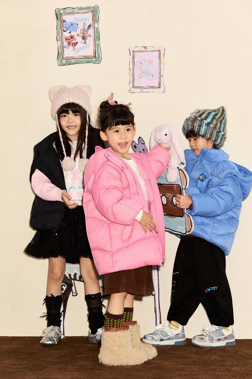
????????This approach is linked to the current competitive landscape of the children’s wear industry. In recent years, the focus of competition in the domestic children’s wear market has gradually shifted from channel distribution and price wars to a contest of design distinctiveness and brand reputation. The expansion into lower-tier markets by adult sportswear brands and luxury children’s wear lines, coupled with the rise of local designer children’s wear brands, is squeezing the survival space of traditional mass-market children’s wear brands.
????????Red Copper’s decision to use ‘patterns’ as the entry point for its design upgrade is a relatively low-effort yet immediately effective strategy: patterns are the most intuitive element for children’s wear consumers and serve as the first visual cue parents use to judge whether a purchase is ‘worth it’. By establishing a stable network of overseas design partnerships, the brand can consistently produce visually distinctive products without altering its supply chain or distribution channels.